I’ve never liked strip malls, but for a long time I couldn’t quite explain why. The buildings themselves aren’t especially offensive. If you strip away the context, a strip mall is not so different from a row of shops that you might find present on a quaint walkable Main Street in a small town.
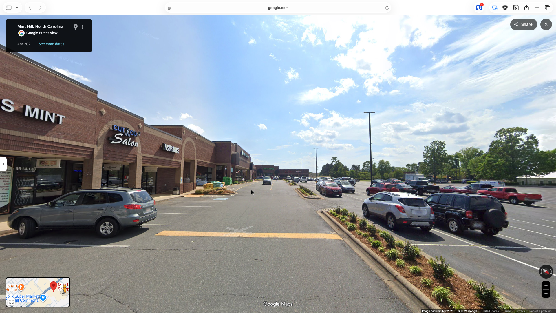
The problem is that unlike a main street, the strip mall is sitting behind an enormous moat of parking that makes it very difficult to get to for anyone not in a car. In order to reach the shops from the street you must cross a wide, hot, unshaded expanse of asphalt which is quite unpleasant.
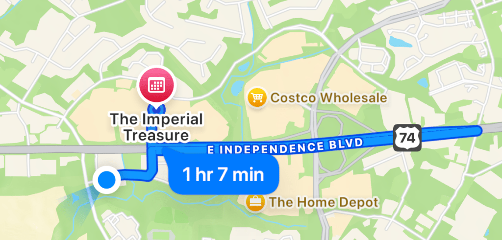
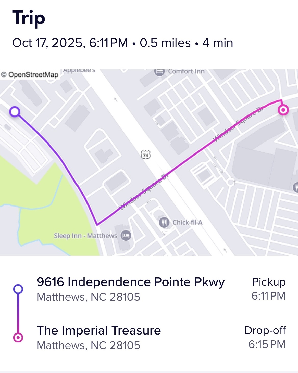
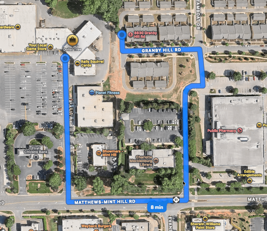
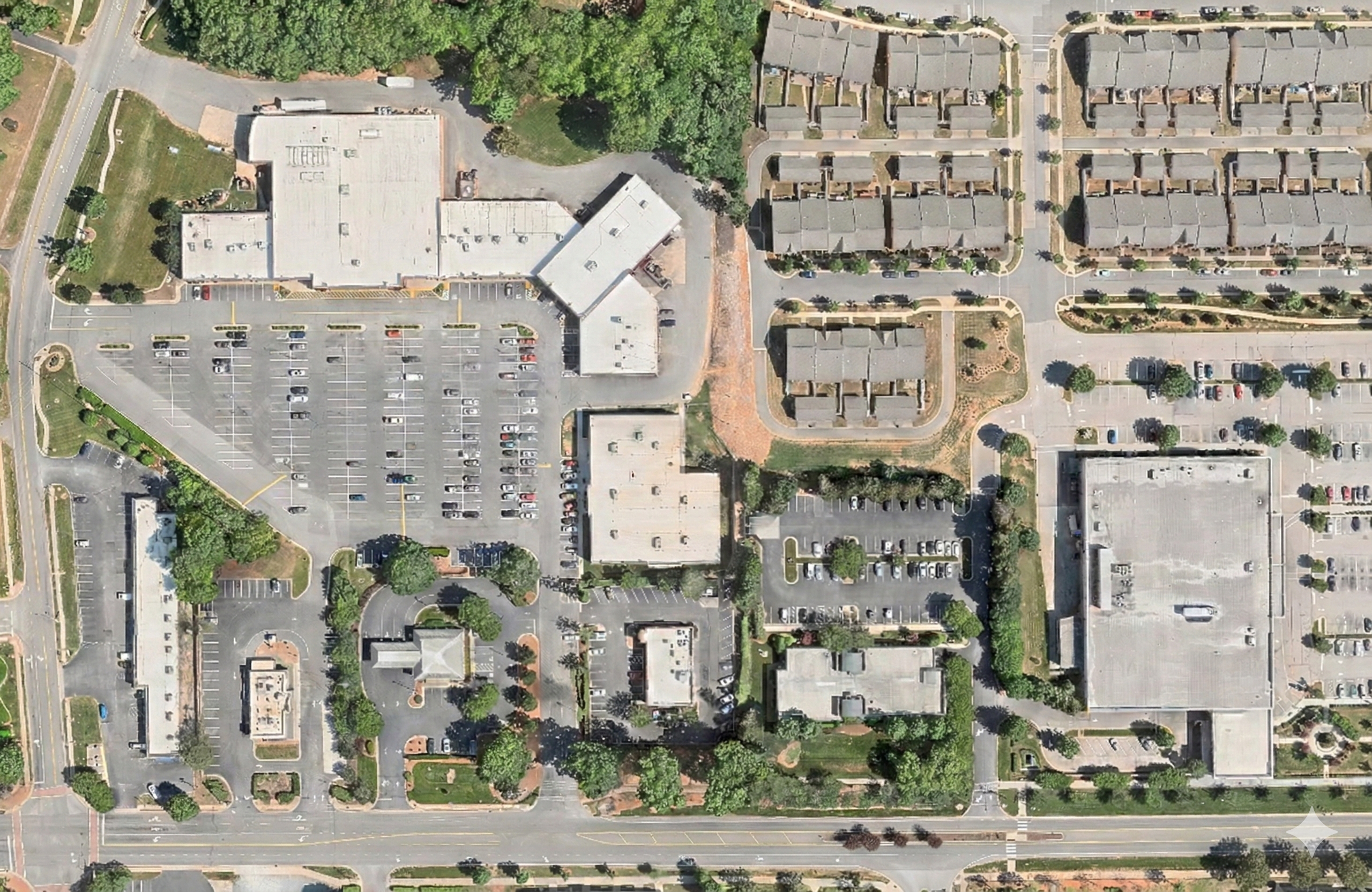
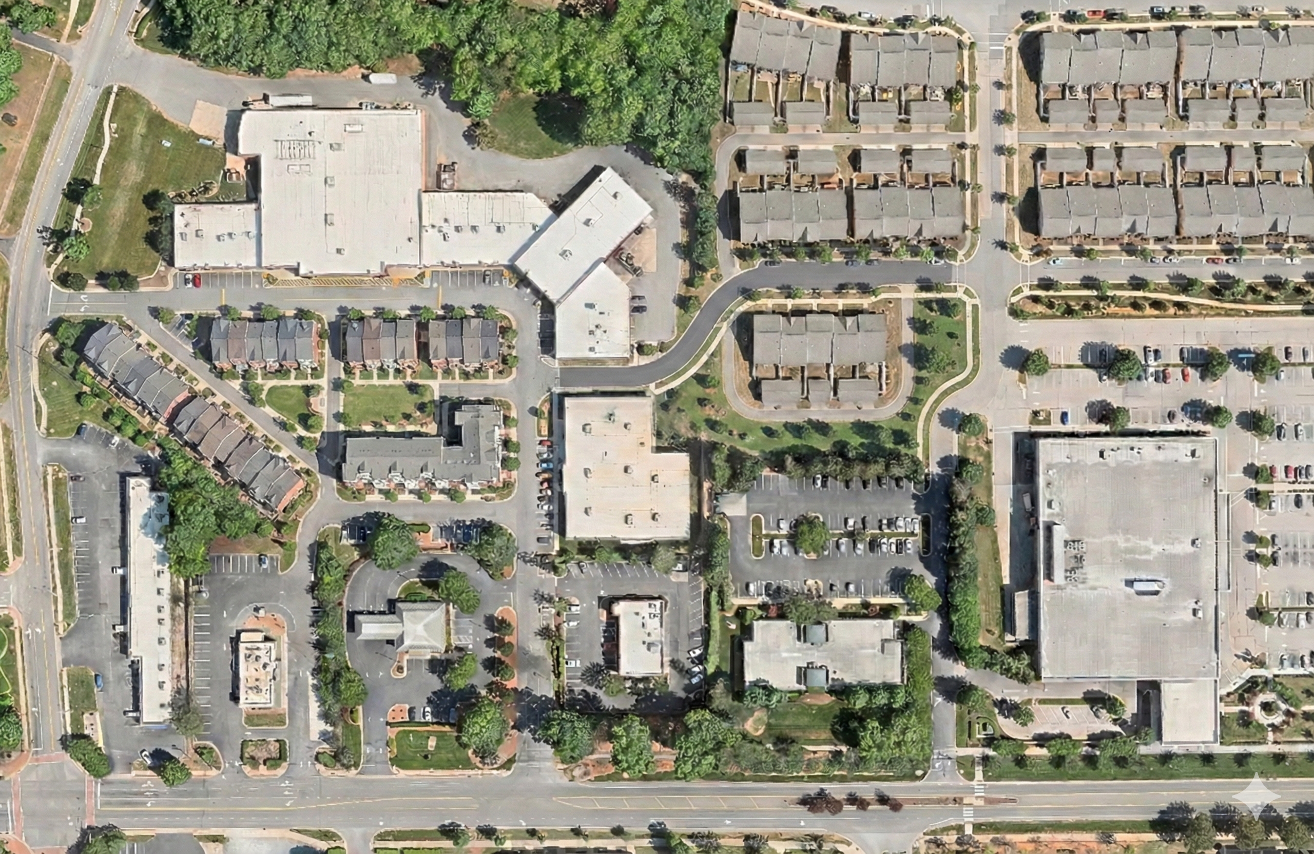
They’re also usually separated from housing. Even when homes are physically close, they’re rarely connected in a way that makes walking easy. For example, take a look at this typical American strip mall located in Mint Hill, NC with a residential development less than 50 feet away. However, because there is no pedestrian connection between the two places the official walking route is nearly half a mile and requires walking along a busy road.
So almost everyone arrives the same way: by car, which then sits in that giant parking lot until they leave.
The assumption that every visitor must store a private vehicle on site for the duration of their visit is what drives the need for dedicating so much land to car parking.
But that assumption may begin to change over the coming decade.
We are seeing rapid improvements in autonomous vehicles from companies like Waymo, such that I think there is a good chance private vehicle ownership may give way to robotaxis if they can be made cheaper per mile.
If people increasingly rely on on-demand transportation, especially autonomous vehicles, destinations won’t need to dedicate vast areas to parking. A vehicle could drop someone off and leave. The site would only need enough space to stage a limited number of robotaxis so that departures are reasonably quick. That’s very different from storing approximately one vehicle per person in the building.
And once you stop designing around having space to store one car for every person, a lot of land becomes available for other more productive uses.
I would suggest that we should build infill housing on disused shopping center parking lots.
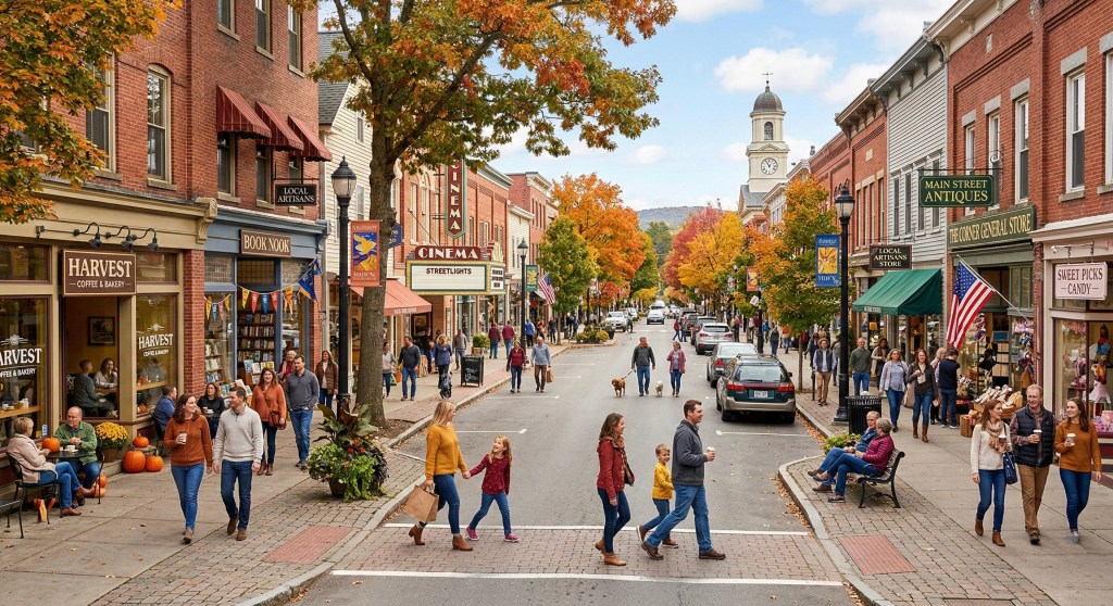
If most of the parking lot were replaced with townhomes, and perhaps a small apartment building, the character of the place would change immediately for the better. The bland soulless strip malls of modern day suburbia would be transformed into the cozy pleasant Main Streets of the past and become a place people actually want to spend time.
Take the strip mall that I mentioned earlier from Mint Hill, it has a general store, a small hardware store, a pizza place, a nail salon, a hair cutter, a gym, and a specialty shop or two. These are everyday businesses that are actually useful to live near. Being able to walk to get a haircut or pick up a few household items would be convenient.
Yet the layout makes living near them awkward or impossible.
Instead of a field of parked cars, imagine a shaded street lined with homes. Doors and windows facing the shops. A small green space tucked between buildings. Paths connecting to adjacent neighborhoods that currently sit cut off by massive six lane stroads (wide, high-speed arterial roads).
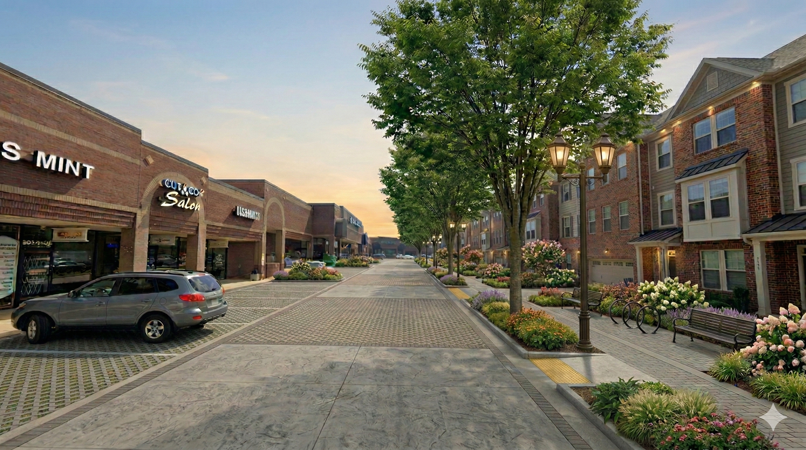
A short, direct link to the existing nearby townhome neighborhood would make the shops part of the neighborhood instead of a separate island. Residents could walk over in a few minutes instead of driving around to the main entrance.
People coming from farther away could still arrive by car, autonomous or otherwise, or by transit.
This kind of infill would make bus service along arterial roads more practical. Strip malls are usually located on major corridors. If housing filled in the parking lots along those corridors, there would be more people within walking distance of each transit stop and more destinations clustered together. For transit riders, the modern-day torturous walk across an expanse of hot asphalt with the sun beaming down on you, would be replaced with a pleasant stroll through tree lined neighborhood streets with shaded sidewalks.
By adding this infill housing we can also help alleviate the issues that many cities in the U.S. are experiencing with regard to a housing shortage in the parts of the city where people want to live. Many regions are short on homes, yet large portions of urbanized land are devoted to parking that sits partially empty much of the time. Reusing that space for housing adds units without expanding outward. It places residents close to daily needs. Some vehicle trips disappear entirely because they can be done on foot.
The underlying strip mall structure isn’t inherently flawed. It’s adaptable. What makes it unpleasant is the dominance of parking and the lack of integration with surrounding neighborhoods.
If the parking requirement shrinks, whether because of changing transportation patterns or different policy choices, the opportunity is straightforward. Build homes where the asphalt is. Connect surrounding neighborhoods to the shops. Let the existing storefronts function as a local town center rather than a drive-to outpost.
The difference between a hostile shopping center and a livable neighborhood might be less about architecture and more about what we decide to store on the land in front of it.